Monday, October 18, 2010

storyboarding : architectural spaces

This was probably the most challenging of the three workshops I participated in. Our final assessment involved drawing a series vignettes that tells a story of a selected building from the approach / entrance and relationship between outside / inside to the main interior spaces which finally progresses to a specific activity. Below are my 12 vignettes arranged on 4 A4 sheets of paper before i transferred them to my black A2 cardboard for presentation.I chose to do the main cafe located opposite the architecture building at UNSW.

Picture 1: Shows the 3 vignettes detailing the approach to the building 


Picture 2: Shows the 3 vignettes which explore the relationship between inside / outside and the entrance to the cafe


Picture 3: Shows the 3 vignettes which explore the main interior of my chosen space i.e. the cafe counter and seating arrangement


Picture 4: This picture outlines my final 3 vignettes which shows the progression from the main interior space to a smaller more secluded area of the cafe where one may go to eat (specific activity)


I decided to cut out the 12 vignettes featured above and arrange them on black cardboard in order for my storyline to become more effective. I thought it added to the overall quality of the storyboard. Overall I found this workshop challenged since it was difficult for me to draw actual objects in perspective. Unlike the other two workshops where all that was required were a reproduction of plans, elevation etc this workshop required one to draw from your own perspective which was indeed challenging. 

Below is the final copy:


Wednesday, September 22, 2010

the final project: rose seidler house . . .

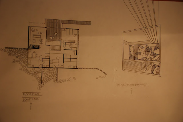
The final assessment for this rotation was extremely enjoyable to compete. I found the Rose Seidler House (Architecture: Harry Seidler) interesting to learn about and despite its relatively square like appearance it contains many crucial architectural concepts such as the free standing fire place which have come to be in a wide range of houses today. It was indeed time consuming drawing the plans, sections and elevations onto my three A2 sized sheets however it taught me many important aspects of architectural drawings such as title headings, north point, rendering walls so that one may differentiate what is in section and what is not. That was an important lesson i gained from this workshop. When drawing a section one must explicitly highlight by blackening out etc what is in section so that it is seen by the viewer. Overall it was a great assignment to work on. Below are my three A2 posters: 

The 1st Poster (Far Left of Composition - Contains Plans):

 
The 2nd Poster (Middle of Composition - Contains Sections + Elevations):


The 3rd Poster (Far Right of Composition - Contains 3D Perspective Drawing):


rendering and shading . . .

This was the 3rd week of this workshop and we began by exploring light and shade and the effectiveness that shadows and darkened patches bring to a drawing. We were told not to draw lines but rather shade or render to build up a perspective. It was an attempt to get us to think about the textual / tonal value of an object. I was thinking more about how to draw an image without lines and my first attempt of a doorway ended badly. Below is my second image of a staircase, in which i have attempted to highlight light and shade in the image as best i could...


The second exercise of this week, was the most challenging and time consuming. It involves transferring the Rose Seidler House from the plans, sections and elevations we were provided with onto an image of the lawn opposite the architecture building. This involved obtaining an image of the lawn and by layering tracing paper onto this, furthermore copying the house onto it. The difficulty of this task was reduced by consulting with my classmates etc. It was difficult since the image had to be drawn to scale. I was just beginning to understand the idea of two point perspective, so my attempt was average. In the end i had to look at an actual image of the house however i managed to complete the task eventually...

3D perspective drawing . . .

This was an extremely interesting exercise to complete. I do engineering with architecture and haven't had much experience drawing objects, in various perspectives so it was a new experience for me. It was initially slightly confusing to comprehend the concept of 'vanishing points' however by the end of the drawing I understood the concept well. 


Once we had completed this exercise the more challenging task was set, in which we had to sketch a building or place in the univesity using our knowledge of perspective and vanishing point. I found it hard to start the drawing as a whole, not knowing where to begin yet. Below is my attempt...

the cups . . .

Our first drawing activity for this workshop involved drawing a given teacup as a:

- plan
- section 
- elevation 


It was a good introductory exercise to familiarize ourselves with three such important views of an object, all of which provide important information. I found the 'section' drawing to be the most difficult concept to wrap my head around. Below is also a perspective image where we had to sketch the cup from our own perspective.